Design

STRATEGY

Design Principles for Alignment & Growth

As a sole designer it's easy to maintain consistency and standardization within my own projects, but this becomes much harder to scale when building an enterprise team. People come forward with different opinions based on their own design experiences, and quality of feedback tends to drop.

  • Empathize
  • Design with Data
  • Default to Simplicity
  • Be Consistent
  • Keep States in Mind
  • Performance Matters
  • Seek Critique

When searching for a way to get better alignment from my team, I came across these 7 Design Principles which we have incorporated into our own design process. As a growth exercise, we audited ourselves against each principle with a score from 1 to 5, and decided what needed to be done to improve that score.


Integrating Design Thinking into the Agile Process

Over the past couple years at Herbalife, we've successfully embraced Design Thinking and Lean UX, incorporating the methodology and process into our Agile development cycles. Rather than go straight to design, we analyze, research and gather feedback on user needs through empathy and clearly defining the problem we are trying to solve. We start our UX documentation by identifying user pain points, predispositions, and overall goal of the project so that all stakeholders are in alignment. Our team also ensures that features are properly defined with a persona in mind, problem/benefit statement, and high-level acceptance criteria.

We conduct whiteboarding sessions with product and development teams, mapping out how users can easily move through a product to achieve their goals throughout their journey. After multiple drawing iterations, the acceptance criteria becomes more well defined and eventually turns into user stories. Our drawings are converted into interactive prototypes, allowing the team to identify where users get lost or confused through iterative testing. Necessary adjustments are made to improve the flow and validate the right design direction.

Make sure to check out UX Process for a deeper dive of this approach.


The Whole is Greater than the Sum of its Parts

For most of my early career, I worked alone or along side other full-stack designers. I've noticed when looking for potential hires that more and more UX "unicorns" are joining the work force.

When I joined Herbalife, UX designers were embedded into product teams which was an enabler for working in silos. The alternative was changing the team into a Shared Service, which presented new challenges as designers could not work effeciently when juggling multiple projects. Various steps in our UX process were unfortunately skipped because of time constraints and we noticed a loss of quality in our core UX disciplines.

  • Design Manager
  • User Researcher
  • Interaction Designer
  • Visual Designer
  • Prototyper & Engineer

In 2018, we decided to change our team's makeup and transition from "unicorns" to new roles that aligned with each discipline. We worked with HR to change titles and job descriptions, identified gaps needed to be filled with new hires, and created a good spread of skills across the team. Over a period of several months, we evolved from a Shared Service to a hybrid Centralized-Partnership Model, allowing team members to partner up on projects and streamline work based on each member's main role. These "mini-teams" are now embedded across projects based on customer or distributor experiences so that they can re-use similar features, UI patterns, and inspiration.

Voltron is greater than the Unicorn Army

Finding a Common Workflow and Toolkit

It's natural for UX designers to want to work with tools that best suit their personal needs, but a lack of standardization of team workflow will hurt productivity in the long run. In discussions with my team, we've had plenty of back-and-forth on which tools are best for design, prototyping and testing. Should we base our decision on features or tasks? Should we use an all-in-one tool or combination of tools that compliment each other? For any one of the tools in consideration, it was easy to find an article or video that said "XYZ is the winner".

To put this debate to rest, we had to come together as a team and documented which features were most important to us, nice to haves, and pie-in-the-sky. We treated this exercise just like any other project, identifying pain points, the benefit of having this feature, and acceptance criteria for what would satisfy our needs.

Each feature had its own card with problem, benefit, and acceptance criteria

Once we completed defining all the features, we were able to tag each one with labels that represented tools in consideration. Filtering by label allowed us to easily visualize how much each tool covered, or what combination of tools gave us the best coverage.

Features organized by category and tagged by tool

In the end our team decided on Confluence + Figma + Zeplin. Having team members in different geographical locations, we felt that Figma was the best choice as it is known for its highly collaborative features. Files are stored in the cloud, team libraries ensure consistency across projects, and it even has a "multiplayer mode" for working on projects simultaneously in real-time. Lastly, we wanted to make sure developers could easily translate our prototypes to code so Figma's inspect mode for developer handoff coupled with the Zeplin plugin for React Native code seemed like the best fit.


Design System: The Final Boss

UX teams can flourish with style guides and pattern libraries, but a design system is a clear indication of maturity across an organization. It requires ongoing collaboration between UX, Brand, and Development teams which can be challenging, but ultimately gives us the framework to build it better.

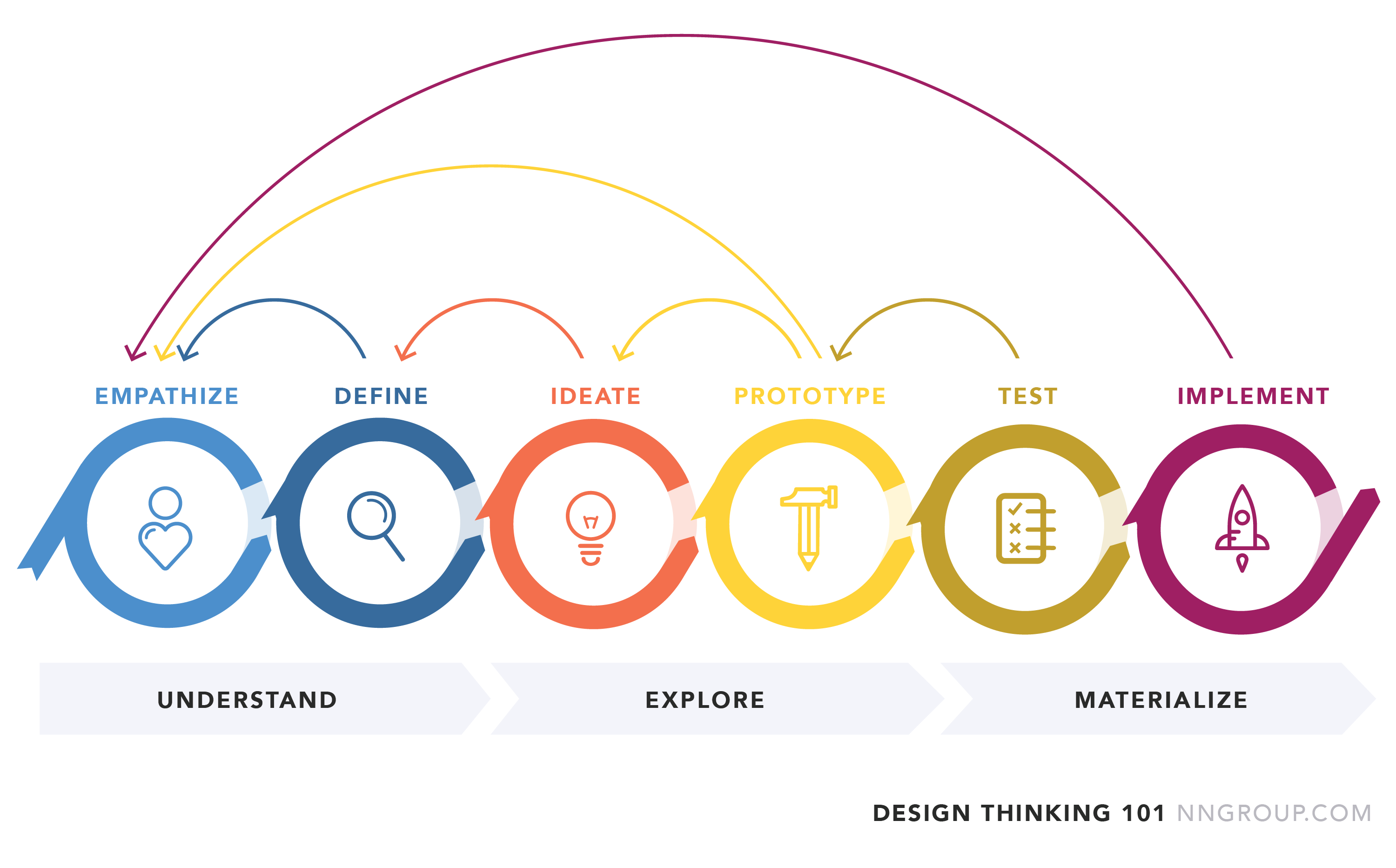
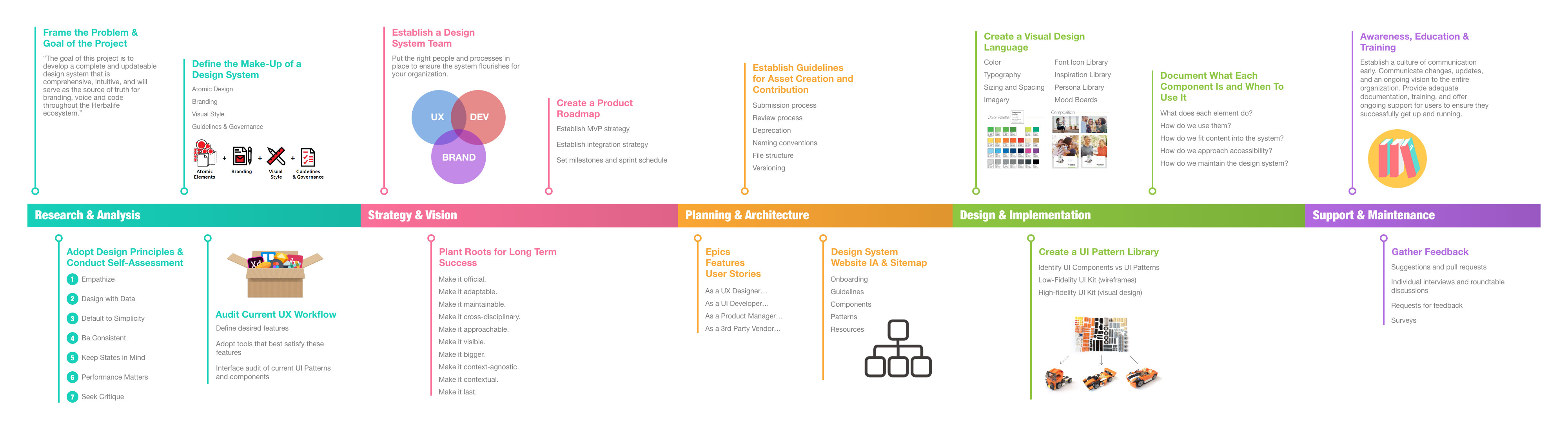
High level roadmap for the approach, adoption, and evolution of a design system

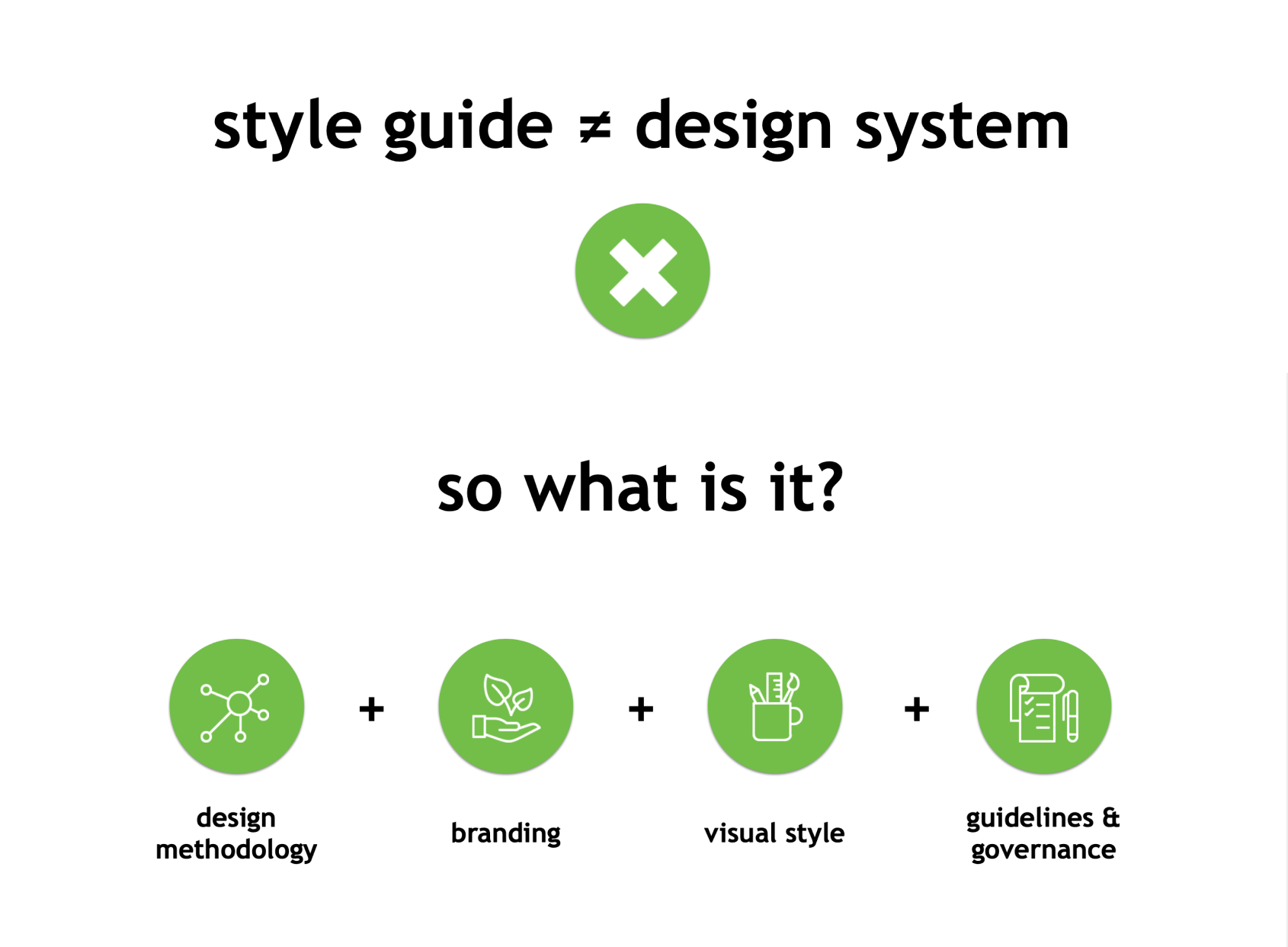
I created the roadmap above to help all stakeholders visualize what is needed to create a design system. It's essential that all teams understand that a style guide ≠ design system. A design system is composed of a design methodology, branding, visual design, guidelines and governance. It's a set of reusable components that can be brought together to create any number of applications within the same ecosystem.


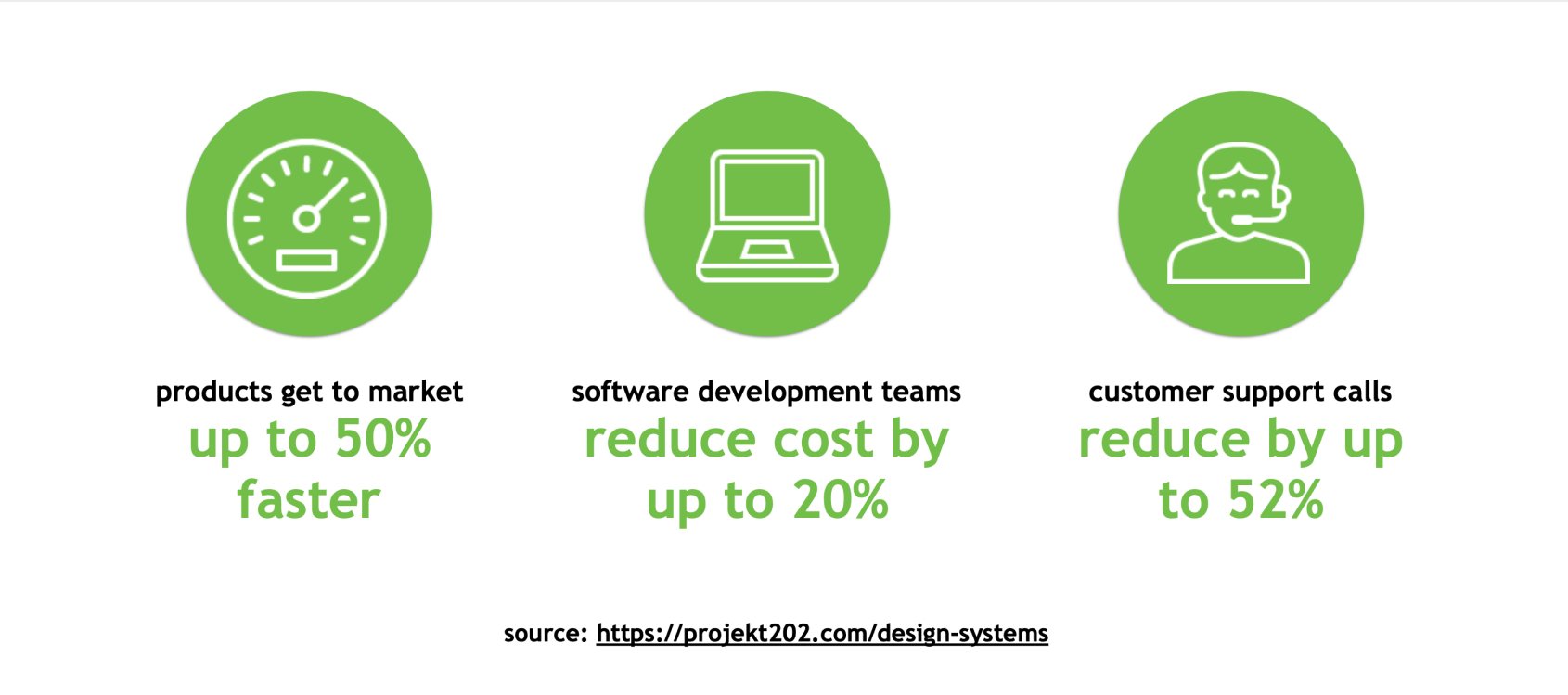
The hardest part of adopting a design system is getting buy-in from the extended team, senior management, and executives. It's important to keep the audience in mind when talking about ROI and business value. Functional teams want to see products get to market faster. Developers want to see reduced cost and re-work. QA and support teams want to see automation and reduced calls. Fortunately design systems deliver all of these and more.


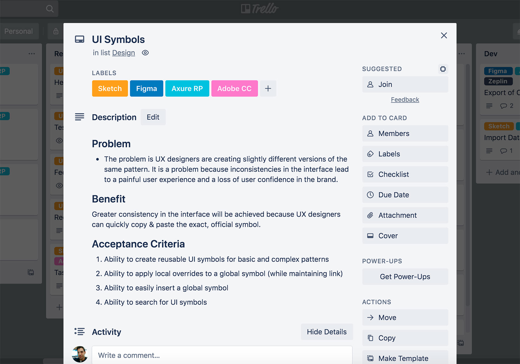
While it is sometimes daunting to secure an investment from leadership for this effort, it does not mean that you can't get started with your team. Like any other project, we created a backlog of features and user stories to start chipping away at components. Each component went through multiple stages before it could be adopted into the design system. As more and more components were completed, we started to see the beauty of atomic design. Larger molecules and organisms were simpler to create as they leverage nesting of components.


Wireframe design system created using Brad Frost's Atomic Design Methodology. Feel free to poke around!

When creating page designs in low-fidelity for our digital products, we make sure to add larger molecules and organisms which can be reused to our Design System. Adopting this federated approach has helped us work towards our goal without the need of a dedicated Design System team or budget. Re-usable components created through various products can be leveraged by any team member to quickly create design concepts that can be used in their own projects.

Next