CURACAO

Case Study

Online Credit Payments

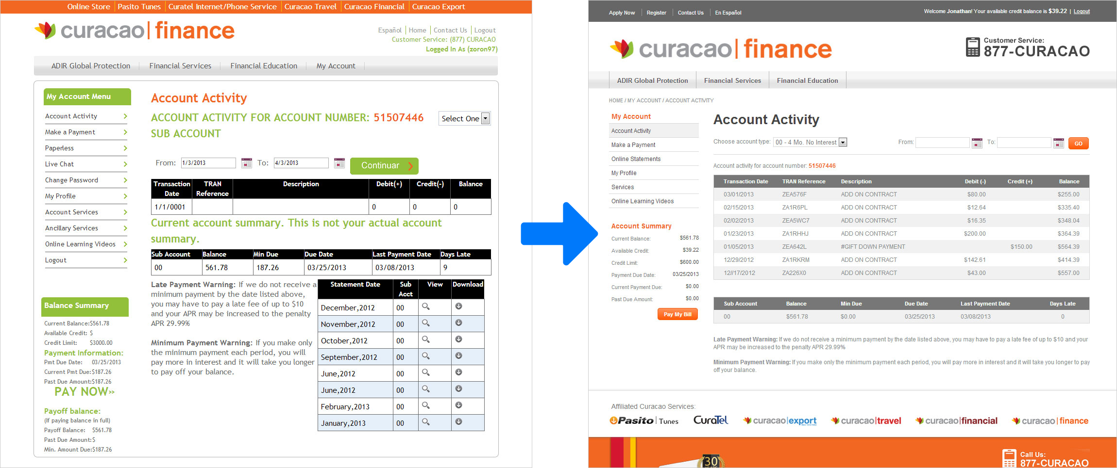
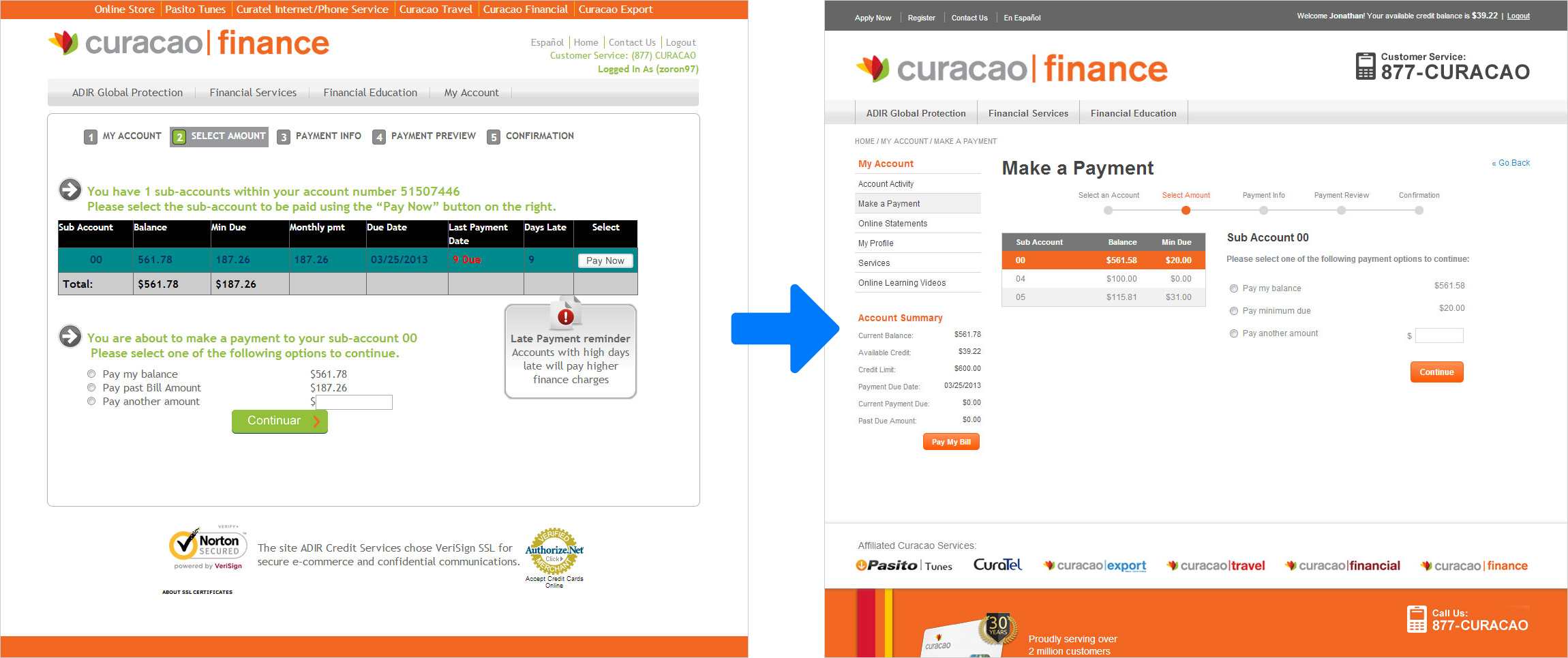
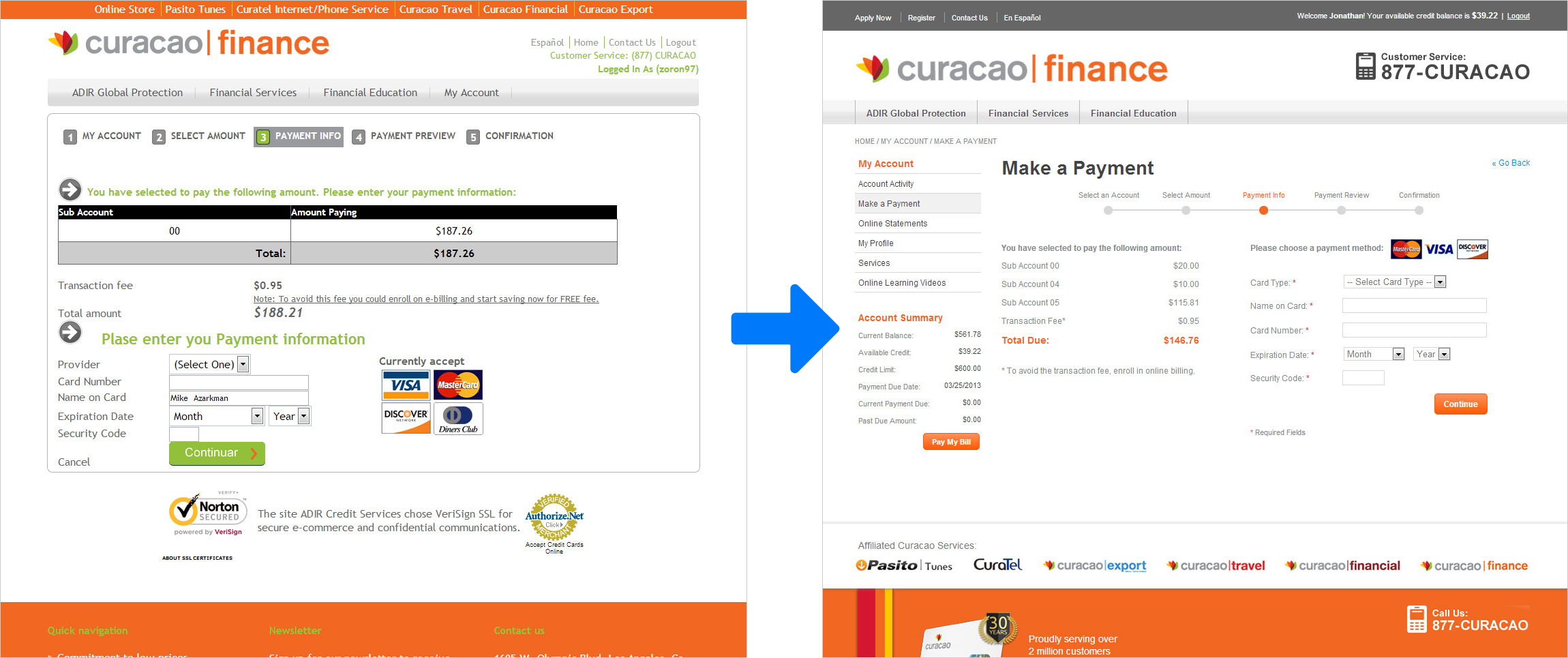
At Curacao, a retail store chain in California, customers were able to apply for a credit line with the company at various brick-and-mortar stores throughout the state. Most of our customer base was not able to obtain credit elsewhere, so a huge source of revenue was the interest payments that came from Curacao credit holders. Unfortunately the paper application process was slow and credit approvals took a considerable amount of time from both our customer service representatives and customers. Looking to speed things up, we launched a new feature allowing customers to apply for Curacao credit online through the E-commerce store. Customers could get approved instantly and start making purchases online within the same session as credit approval. While this capability proved to help in making their first purchase, over time we started noticing that users were not making timely credit payments against these purchases. After digging a little deeper, we were able to identify two main problems that our users were facing:

  • Users did not know there was a separate portal for making credit payments and would mistakingly visit the E-commerce store instead, only to reach a dead end

  • Users who eventualy found the payments portal could not figure out how to log in to make payments or review their account information


55 Minutes on the Problem, 5 Minutes on the Solution

Back in 2012, "user experience" at Curacao wasn't really a thing as most people in the field were still considered "web designers". There was no established design process or design thinking methodology that took you from discovery to research, definition to ideation, and design to implementation. Simply put, we were a one man design team partnered with a one man development team. Regardless, we still started by framing the problem and taking various steps that would be considered UX research today.

Designed by Gal Shir

Even though our research toolkit was limited, we still tried to leverage data to inform our decision making. We first fired up Google Analytics to check existing funnels and find out where users came from to look for the online payments portal. Overwhelmingly, users were coming directly to the E-commerce store which meant that the store's homepage was the first step in the flow rather than a Google search or another referring site. The majority of users always ran a site search for products as their first action, so we decided to take a look at the keywords being searched each month. That's when we discovered the main problem.

  • Three out of the top five searches per month were related to making online payments - and lead to a page with no results.

The search results page references product meta-data when searching for keyword matches to populate results. The site search was working as intended, but our users had differenct expectations for its behavior. Phrases like "pay my bill" or "pay credit card" are nowhere to be found in product titles and descriptions, hence the pages with no results. Fortunately the Magento platform allows you to override searches and directly map search terms to hard URLs. Within the same day of our findings, every online payment related search was now mapped to redirect the user to the online payments portal.


One Problem Down, One More to Go

Now that we solved the first challenge by bringing users to the right place, we needed to make sure that they could actually log in and complete a payment. On the old homepage, the CTA for logging in was just a text link in the upper-right hand corner of the page and was easily lost in the clutter. I focused on making this the most prominent action on the homepage by adding a dedicated login form in the main hero section. Taking inspiration from PayPal, I also added a mini-login form to the header so it was globally accessible.

Homepage redesign (right) of online payment portal emphasizing login as the primary action

Knowing our user base in the Latino market was not tech savvy, I also increased visibility of the customer support line by prominently displaying it throughout the payment flow, letting them know at all times that help was just a phone call away. We cleaned up the UI by standardizing components and moving away from the legacy design. Taking inspiration from other credit payment sites, I added a more familiar pattern for a progress indicator to help set user expectations for how close they were to completing a payment.


Conclusion

This project was a big success for the online store division as it proved the case for a digital application process. I was able to demonstrate that design is not just improving a single product's usability, but actually delivers business value. After this project, our team got the green light to redesign all web properties including the corportate website and E-commerce store for mobile and desktop (see below).

  • Increased the findability of the online payment portal

  • Improved the user flow for making online payments

  • Reduced over-due credit payments and calls to customer support

Project (2012-2013)

Mobile Store

The online store was built with an older version of Magento's CMS which did not support Magento GO at the time, so it was too difficult to convert it to a responsive solution. We opted for an adaptive mobile site instead, which allowed me to design freely without sacrificing any features from the full web experience.

Project (2013)

Desktop Store

Prior to my arrival, Curacao outsourced a team to build their online store but things got rushed and the attention to detail was lost. The site had numerous UI issues and did not use best practices when it comes to online retailing. The online store was treated like any one of Curacao's brick-and-mortar stores, so we had to prove ourselves sales-wise to keep funding intact.

Next Prev